- Impact
- 13,169
Need a logo for one of my other businesses.
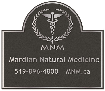
As you can see it is quite fuzzy and desperately needs a good clean up.
1. Current Website Header

2. Nicer Graphic

3. Example

READ WHAT I NEED VERY CAREFULLY
Winner get $100 USD Paypal, contest closes 10 days after this post or when end design is chosen.
I need a new web header exactly the size as example one and it must be a clear PNG or similar file so I can put it on any color background.
The font uses is Trebuchet MS and the design must be exactly the same as in example one except the phone brackets in the area code must be removed as in example #2.
Example #3 is all I have, for some reason I can no longer find the original files but it gives you an example of what the logo looks like.
The winner is whoever can reproduce the best version of my #1 Example without the phone brackets.
Everything else goes, whatever looks like the best web header design, shadows, 3d, flat, anything can be put forward. Whoever I like the best wins. Colors are black and a nice forest green, and I am open to whatever dark green looks the best.
Good Luck
PS. Winner must provide all files and two separate versions, one just the logo and the other the logo with the phone number and web address. Also a favicon of just the logo would be appreciated.
As you can see it is quite fuzzy and desperately needs a good clean up.
1. Current Website Header
2. Nicer Graphic
3. Example
READ WHAT I NEED VERY CAREFULLY
Winner get $100 USD Paypal, contest closes 10 days after this post or when end design is chosen.
I need a new web header exactly the size as example one and it must be a clear PNG or similar file so I can put it on any color background.
The font uses is Trebuchet MS and the design must be exactly the same as in example one except the phone brackets in the area code must be removed as in example #2.
Example #3 is all I have, for some reason I can no longer find the original files but it gives you an example of what the logo looks like.
The winner is whoever can reproduce the best version of my #1 Example without the phone brackets.
Everything else goes, whatever looks like the best web header design, shadows, 3d, flat, anything can be put forward. Whoever I like the best wins. Colors are black and a nice forest green, and I am open to whatever dark green looks the best.
Good Luck
PS. Winner must provide all files and two separate versions, one just the logo and the other the logo with the phone number and web address. Also a favicon of just the logo would be appreciated.


