Dynadot โ€” .com Transfer

$40 logo design for kitchen furniture company

NamecheapNamecheap
Watch
Status
Not open for further replies.
We need a logo design for a kitchen furniture company called "Storia".
Here's an example of kitchen furniture:

example
example2

You could also use the word "cucine" (means kitchen in italian) in the logo.
You can use both uppercase and lowercase letters, any colors upto 2 colors (you can also use 3 colors but one must be either black or white).
The logo must have a modern look, lots of style, no "classy" or old fashion designs.
Deadline in one week.
 
0
•••
The views expressed on this page by users and staff are their own, not those of NamePros.
AfternicAfternic
TAKE 1

 
Last edited:
0
•••
Hi Subc0nci0us,

Here's my entry.

originall_storia.png


Feedback is appreciated.
 
0
•••
Here's my entry. Hope you like mine. All comments are welcome.

logo1.jpg
 
0
•••
0
•••
First concept:

storia7po.jpg


The saucepan is to represent the kitchen and is custom-made.

Feedback appreciated :)
 
0
•••
contemporary, clean logo. All vector

storia-unflat2.jpg
 
0
•••
Thank you guys for your designs. My business partner will give u feedback when he sees them. Waiting for more nice ideas.
 
0
•••
Kitchen furniture, interesting...but are you looking for a busy/detailed logo or a simple/clean one?
 
0
•••
Simple and clean i guess. It's going to be on the sign outside of the store..
 
0
•••
Here is my logos.

version1kitlogo.jpg


version2kitlogo.jpg


version3kitlogo.jpg


version4kitlogo.jpg


Thanks.
 
0
•••
storia cucine

hi dear all, i am the one who set up the contest using subconscious on my behalf.

first iwould like to comment on all logos and then i'll give you some tips.

vivsin: its not quite what i had in mind. its nice overall but i dont think i would go for fancy colours like purple. i would recomend keeping the font but trying different colours. your design is too black, or too purple. try using more than one colour as you did on your second version. i quite like dark brown and orange.

guetizo:very nice work. nevertheless i dont think it really represents a kitchen shop. it looks quite mathematic. i prefer house concepts, stylish curves maybe? the same applies to you about the colours. lets all try dark brown and orange. also liked the fact that you choose a letter to play with.

adiboy:your third version gave me the idea of using the colours dark brown and orange. i know yours is almost black and yellow but thats what brought me to brown and orange. i like the fact that you are keeping it simple. i dont like the font that much. nice idea putting "cucine" into letter "o".

vip-ip: your cards design was really nice and i loved the colours. the logo doesnt tells me much. it has to something else. maybe a simple font...something more to it??? add the word "cucine" as well. keep to the colours, they are really good. black-grey and orange is a nice option as well.

will7: your font is great both in "storia" and "cucine". i am not sure about the colours. probably brown, orange, grey or black is better. i like the saucepan, althought i dont like the whole idea of the circle. perhaps putting everything into a nice square border, just the pan and the letters, without the cicrle. great work overall.

zombie: although its not keeping up with the colours i had in mind, overall i think its a really good, simple logo, really versatile (i can put it in a stand, banner, everything...). dont agree that much with the waterdrop, although i like the idea of icons. try more colours...putting a background colour and then a different colour for the squares. good work, i like it simple.

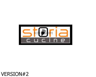
krishm: i like version 2 and 3. it looks simple and i like the box idea. it looks like a stamp and makes it easy to use and print. the font is really good as well as your colours. i dont like the fork that much. its a bit....scary. maybe trying something else out of a kitchens equip. or a different type of fork. very good work overall.

GENERAL TIPS TO ALL................

lets all use the following colours. dark brown, orange, black, grey (yellow and red as optional, only in cases you have a great, great concept)
i like the fact that almost all of you are keeping it simple and clean. i think that busy and complicated ideas have few chances to work well. customers have to remember the logo and be able to describe it.
on tuesday i will give you a full report as i am not the only owner of the place and more people have to decide about it. in case time is neeeded, extensions will be given but i am only talking about two extra days.
i appreciate all of your work and i congradulate you for your ideas. keep on until we have a winner. more feedback on tuesday.

regards H.
 
0
•••
Revised. Feedback, please! (300 dpi image)
 
0
•••
this is mine.....
 
0
•••
ill enetr ill work on something now :)
 
0
•••
Hi hitman474,

hitman474 said:
guetizo:very nice work. nevertheless i dont think it really represents a kitchen shop. it looks quite mathematic. i prefer house concepts, stylish curves maybe? the same applies to you about the colours. lets all try dark brown and orange. also liked the fact that you choose a letter to play with.
Thank you for you nice and constructive feedback. That's definately a strong contribute for achieving a very good logo. As for me I'm willing to move foward.

On the first design the idea of the cube was the representation furniture, in the case, kitchen furniture. Anyways, moving foward... :)

In this set of design I tryed to capture the "inner-house" concepts (furniture, because this is all about it!) using of course, the pallete of colors that you gave us to play.
I know that you suggested stylish curves but I want you to see this approach and, of course, giving the usual appreciated feedback.
As for the font chosen, I stick with the same because, as you stated, give me the hability to have letters to play.

Let's see the design.

originall2_storia.png


Once again, feedback is welcome & appreciated... on tuesday. :)
 
Last edited:
0
•••
Thanks for the feedback!

storia24dg.jpg


Feedback appreciated :)
 
0
•••
storialogo.jpg

Feedback appreciated - Help me help you :)
 
0
•••
Take Two


and


and complicated one

 
0
•••
Quick Feedback

vip-ip: better but change the font to something better. it looks like a times new roman and needs something more stylish and interesting. get examples from what others guys (or girls) use.

squarexdesign: half of it looks realistic using the wood surface and the other half looks too simple. try using a different font as well and lets forget the spoons and forks for a while. try using other icons. perhaps that ventilator thing that stands over a kitchen. i dont know if you know what i mean...

guetizo: i am getting really impressed here. it looks really modern and design is nice. i like the idea of putting a whole kitchen (actually the most important part of kitchen furniture) in the logo. keep the font but try adding some more colour to the letters. its too black, maybe dark brown. i like all versions and i'll later in the week what my partners like the most. keep on...

will7: it looks quite like it now. warmer and gives this nice impression of family business. i am not pretty sure about the icons. the third version with the loaf is way too busy and hasnt really much to tell about italian design (architectural) "cucine". i like the border and the font, the colours as well. try designing that ventilation thing i was talking about. ventilators look like image a.

border7: now that i've seen other designs it looks kinda simple. try using the guidelines provided in my previous post.

vivsin: while i didnt like that much your first approach this one is much better. i really like a lot version 2 out of your 3 recent ones. i wont comment now on 1st and 3rd but your second one seems to get the point in terms of font. i think some of my partners will really like it. try an icon now.

thats all guys more feedback tomorrow after meeting with the other heads in the office. thank you...appreciate your work very much.

Mr. H
 
0
•••
Status
Not open for further replies.
Appraise.net
Escrow.com
Spaceship
Rexus Domain
CryptoExchange.com
Domain Recover
CatchDoms
DomainEasy โ€” Live Options
DomDB
  • The sidebar remains visible by scrolling at a speed relative to the pageโ€™s height.
Back