


- Impact
- 18,389
I am looking for some input on logo selection.
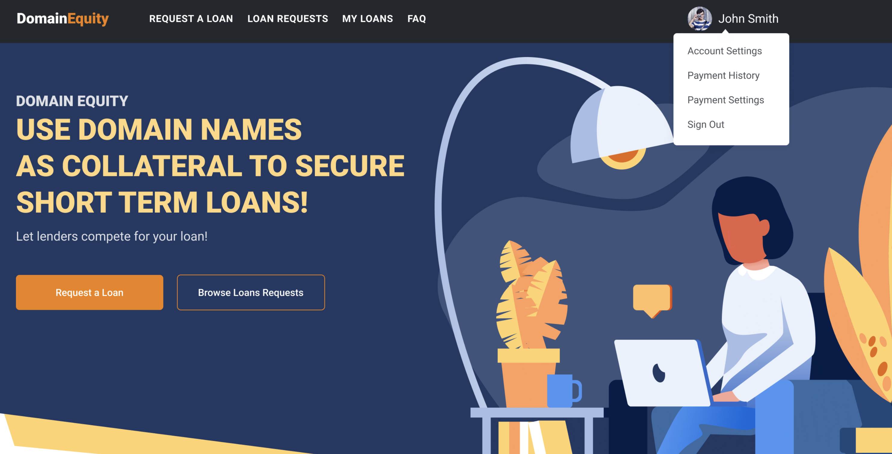
We have been working to finish a project called Domain Equity for peer to peer lending -- empowering domainers to access liquidity outside of the conventional banking pool. For those not aware, DomainEquity was a project long before COVID-related shutdowns, but has taken added urgency as a result of pressure on the banking system.
The site is scheduled to go live sometime in April. Here is a preview of the homepage:

And here is a walk-through:
https://www.loom.com/share/547cf9f24a9d4f1e90701361f34651fc
We have some logo concepts -- here is the short list of final candidates:

For the long run, I tend to prefer a logo that can ultimately be branded in a way that can be logowear, e.g. you could put it on a baseball cap, etc.
Welcome any feedback.
We have been working to finish a project called Domain Equity for peer to peer lending -- empowering domainers to access liquidity outside of the conventional banking pool. For those not aware, DomainEquity was a project long before COVID-related shutdowns, but has taken added urgency as a result of pressure on the banking system.
The site is scheduled to go live sometime in April. Here is a preview of the homepage:
And here is a walk-through:
https://www.loom.com/share/547cf9f24a9d4f1e90701361f34651fc
We have some logo concepts -- here is the short list of final candidates:
For the long run, I tend to prefer a logo that can ultimately be branded in a way that can be logowear, e.g. you could put it on a baseball cap, etc.
Welcome any feedback.


")

