Rainmaker-NL
Established Member
- Impact
- 330
Contest: 3 matching logos / images for the 3 main products of our website
Prize: $ 100.-
Contest End Date & Time: May 7th 2019, 20.00 PM CET
Size requirements: should be adjustable in size and mobile friendly and with transparent background
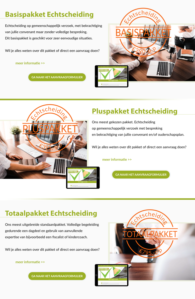
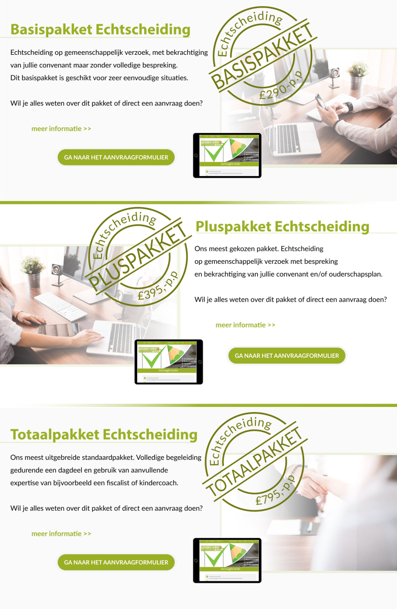
General requirements: on https://www.scheiden-online.nl you can see our website. Just below the middle part of the site you see 3 big Stamps (Basispakket, Pluspakket and Totaalpakket) with a name and price inside.
Recently we added a video to our website. You can see this video at the top of the homepage (the right block of the 2 green blocks just below the header slider. We like the new look of the website as it is in the top (with the 2 green blocks). The Stamps do not really fit to the website anymore, so I would like to change them and replace them with new images.
To give you an idea where I want to go:
https://www.vyond.com/plans/
Here you see the images with the pricing plans. I like the images where they integrated drawings with a photograph and a tablet.
Our products ar divorce packages for a fixed price. Only for couples who agree together. A Basicpackage, a Pluspackage (most used) and a totalpackage.

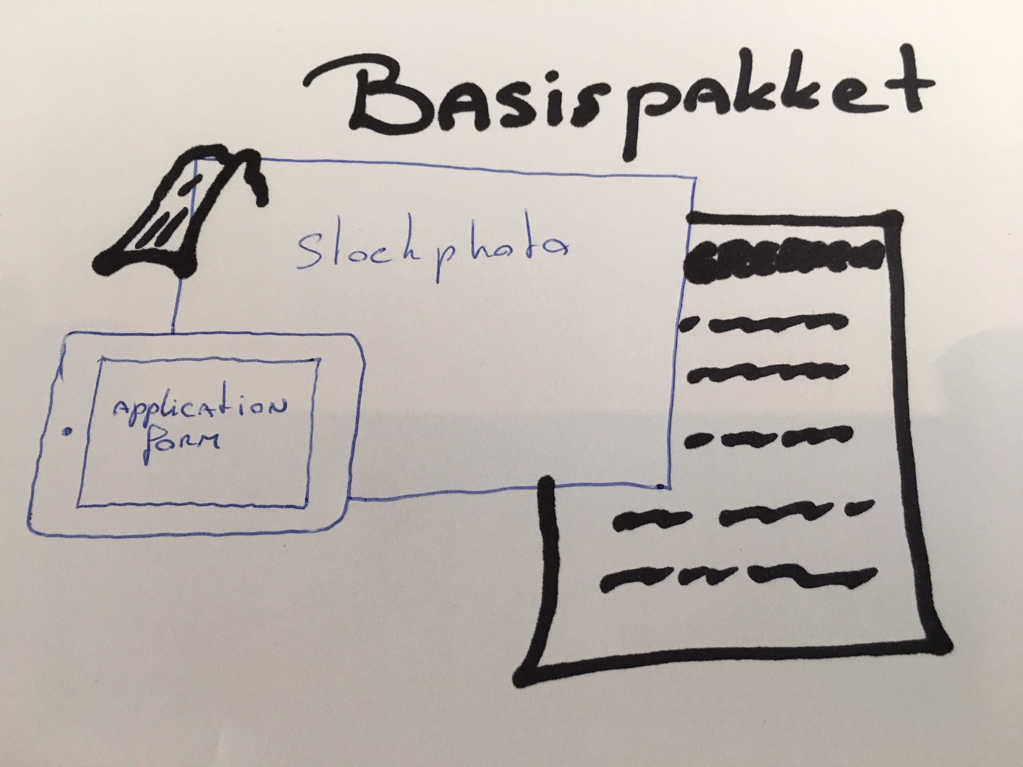
I am no drawing artist, but it could be something like this above where you have a setting just like on the website that I showed you, and then have our application form shown on the tablet and the drawing could be a lot of things, like a divorce agreement, a lawyers tie hanging over the photo, etc etc.
Please do not feel bound to what I drew up. It is just a small suggestion for the direction where it could go. But I am open for any other direction that is nice. The video can also give you some inspiration!
The reason why the drawing is important: the video consists of drawings and this way the site becomes more cohesive.
And I need 3 versions, so for every product there is a different image.
I will give feedback to show you the way.
Cannot wait to see what you come up with!
Regards,
Auke
Prize: $ 100.-
Contest End Date & Time: May 7th 2019, 20.00 PM CET
Size requirements: should be adjustable in size and mobile friendly and with transparent background
General requirements: on https://www.scheiden-online.nl you can see our website. Just below the middle part of the site you see 3 big Stamps (Basispakket, Pluspakket and Totaalpakket) with a name and price inside.
Recently we added a video to our website. You can see this video at the top of the homepage (the right block of the 2 green blocks just below the header slider. We like the new look of the website as it is in the top (with the 2 green blocks). The Stamps do not really fit to the website anymore, so I would like to change them and replace them with new images.
To give you an idea where I want to go:
https://www.vyond.com/plans/
Here you see the images with the pricing plans. I like the images where they integrated drawings with a photograph and a tablet.
Our products ar divorce packages for a fixed price. Only for couples who agree together. A Basicpackage, a Pluspackage (most used) and a totalpackage.
I am no drawing artist, but it could be something like this above where you have a setting just like on the website that I showed you, and then have our application form shown on the tablet and the drawing could be a lot of things, like a divorce agreement, a lawyers tie hanging over the photo, etc etc.
Please do not feel bound to what I drew up. It is just a small suggestion for the direction where it could go. But I am open for any other direction that is nice. The video can also give you some inspiration!
The reason why the drawing is important: the video consists of drawings and this way the site becomes more cohesive.
And I need 3 versions, so for every product there is a different image.
I will give feedback to show you the way.
Cannot wait to see what you come up with!
Regards,
Auke


