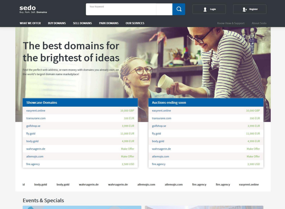
The popular domain name marketplace, Sedo, has unveiled a brand new, comprehensive redesign that marks the end of an era in terms of the company’s traditional blue and white colour scheme, with the new design opting for a colour scheme consisting primarily of grey and blue, with all pages being affected by the marketplace’s redesign.
The new design includes a brand new homepage that is far cleaner and more concise than its predecessor. The featured domain names take pride of place on the homepage, along with adverts for marketplace auctions and Sedo’s own auction events.

Searching for domain names is as simple as ever with the new design, thanks to the ever present domain search bar at the top of the page, and easy access to a range of features once you’re on the domain search page. Sedo’s redesign also makes it easier to switch between languages, with 12 different language options available, including Chinese.
Sedo CEO Tobias Flaitz said “We’re very proud of the newly designed website going live. This crucial step upholds Sedo as THE most trusted and leading business partner for global premium domain trading. With this responsive design now available on all devices, the opportunities for success are increased and supported by value adding services and maximizing domain monetization.”
One change that all regular Sedo users will see is the enhanced domain landing page. While the design of Sedo’s parking pages are currently the same, the domain’s landing pages have had a complete redesign, with a central image and statistics. The domain landing pages are all mobile friendly, which, considering that the smartphone is now the most popular way to browse the Internet, is very good news.
The landing pages' "Buy Now" button has been moved to the right of the page on a desktop layout, but becomes centralised on the mobile version.
Early reactions to this redesign are mixed, with some investors calling the new interface "nice, elegant and more professional", while others are more critical.
Sedo regularly published weekly sales figures totaling $1 million or more, so it will be interesting to see whether this new design has a positive or negative effect on those figures in the next few months.
The new design includes a brand new homepage that is far cleaner and more concise than its predecessor. The featured domain names take pride of place on the homepage, along with adverts for marketplace auctions and Sedo’s own auction events.
Sedo's New Home Page
Searching for domain names is as simple as ever with the new design, thanks to the ever present domain search bar at the top of the page, and easy access to a range of features once you’re on the domain search page. Sedo’s redesign also makes it easier to switch between languages, with 12 different language options available, including Chinese.
Sedo CEO Tobias Flaitz said “We’re very proud of the newly designed website going live. This crucial step upholds Sedo as THE most trusted and leading business partner for global premium domain trading. With this responsive design now available on all devices, the opportunities for success are increased and supported by value adding services and maximizing domain monetization.”
One change that all regular Sedo users will see is the enhanced domain landing page. While the design of Sedo’s parking pages are currently the same, the domain’s landing pages have had a complete redesign, with a central image and statistics. The domain landing pages are all mobile friendly, which, considering that the smartphone is now the most popular way to browse the Internet, is very good news.
The landing pages' "Buy Now" button has been moved to the right of the page on a desktop layout, but becomes centralised on the mobile version.
Early reactions to this redesign are mixed, with some investors calling the new interface "nice, elegant and more professional", while others are more critical.
Sedo regularly published weekly sales figures totaling $1 million or more, so it will be interesting to see whether this new design has a positive or negative effect on those figures in the next few months.
Last edited:


