Dynadot

REQ-LOGO $30 - ClotheslineNY Laundry Services

NameSilo
Watch
Status
Not open for further replies.
Hi Guys,

It's been a long time since I posted here, though I have been working on a new web design/dev and small business project lately for ClotheslineNY, a retail laundromat and dry cleaners location in New York.

We have a current logo concept that we don't really like (plus it's got a web graphic that isn't custom and that needs to change). Here's the contest format:

Type of Contest: LOGO Design

Prize: $30.00 via PayPal

Contest End Date & Time: Dec 10, 2018 or earlier if a great logo is found

Size Requirements: Any

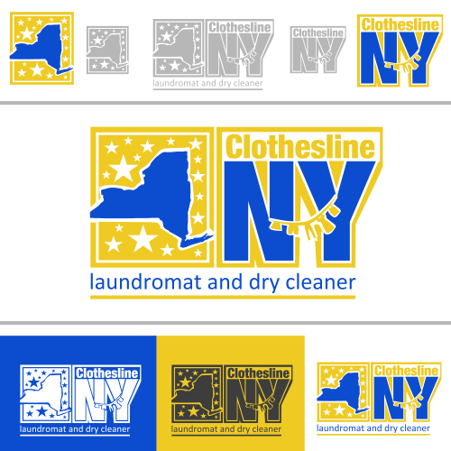
Color Requirements: Trying to stick with Royal Blue (#0C4DCF) and Goldish Yellow (#EECA23) with variations welcome

File Requirements: Must be vector. EPS preferred, but PSD or XCF will do as well

General Requirements: Logo should be something related to laundry services - a laundromat, dry cleaners, tailoring, and with bubbles maybe if it's possible. If you can come up with something really good or catchy (not too cheezy or cartoonish) using clothes or a clothesline, feel free. We may be willing to work with the winner for future graphics to do with services like wash & fold or pick-up/delivery.

Thanks and good luck,
Our House
 
1
•••
The views expressed on this page by users and staff are their own, not those of NamePros.
CLOTH.png
 
0
•••
Thanks for the entry Tony. Looks good, but not sure if it's what we want exactly. Maybe play around with it a little.

The first thing I noticed is that the text layer isn't in the front, so it's hidden behind the image in the middle. The font and outline make it kind of softball-ish looking, which isn't necessarily a bad thing if the letters aren't as thin. The graphic in the middle is ok. I'm trying to figure out if we like the black & white and color mix in the same image.

Something the owner said to me just now that may come in handy for everyone...

"Royal blue background bright yellow lettering streamlined look. Bright electric royal blue with neon yellow letters."

Hopefully that helps.

Thanks,
OH
 
0
•••
3
•••
Hi LD,

Looks good and clean. I'm being asked if it's possible to get a men's suit in there somehow without taking away from the professional look. Not sure if they mean a clip art suit, a real image, or something in between. Not cartoon-y I guess.

The suit is for appealing to the dry cleaning half of the store & services.

I had an idea to hang it behind the "NY" for contrast, but it would probably be too big and disproportionate to the text (unless it turned into a tagline or something similar). The owner however suggested to put the suit on the left of your whole concept.

The bubbles and clothesline look pretty nice and the font is good as well.

Thanks,
OH
 
0
•••
Bump for anyone who is still interesting in trying to snag this one quickly with only 5 days left to go!
 
0
•••
1
•••
2
•••
1
•••
Now we're cooking with gas! Nice work folks.

Tony, much better than the first attempt. The colors are a bit off compared the royal blue and yellow/gold hex colors listed in the OP. If you have time before the contest closes on Monday, maybe try playing around with those or close to them and maybe mess around with the "i" tie in Clothesline. Right now it looks a bit more like a double L. Obviously don't copy what jeproox did, but his entry after yours does a better job of capturing the concept.

Excellent Clothesline. The NY could use a little help (not sure how), but the first word is awesome. We love the bubbles over the washing machine and also love the look of the tie. What do you think about adding a faint suit outline around the tie? Would that make it better or would it take away from what you have now? I'm having trouble visualizing which would be nicer.

Either way, if the NY was sharper, it would be close to perfect. Nice.

NM, really really slick. Both of them look great. We're open to other variations if you have anything in mind, but I personally can't think of much to change. It's just a matter of whether the owner decides to go with your concept on the 10th.

All in all, good work everyone! Right now it's looking like a close race between the last 2 entrants: jep and NM.

Thanks,
OH
 
0
•••
thanks for your feedback, this is the revision..
cn.png

cn1.png

cn2.png
cn3.png
cn4.png
 
0
•••
1
•••
0
•••
Hello,

Thank you for your feedback!

I come bac with updates:

C2.png


c4.png


c3.png
 
2
•••
Looking nice.

This last one is the best, with an NY that has a background from one of the two above it. Not sure if the blue or the yellow is better. It might only matter when the logo has to be inverted for dark/blue backgrounds. Definitely keep the bubbles above the O washing machine. Having bubbles as the guy's head is a little strange. Good job though.

Tony, definitely better than the last one. It's nice, but probably not what we're looking for.

Hello,

Thank you for your feedback!

I come bac with updates:

Show attachment 104433

Show attachment 104434

Show attachment 104435
Very good. The 1st one is spot on and really hits. Your original design was clean and professional. This revision definitely adds a level of branding with the logo and hits most, if not all of the elements we were looking for.

ONE DAY LEFT FOLKS! We'll announce the winner by midnight tomorrow (Monday, Eastern US time).
 
0
•••
0
•••
0
•••
Here's the multi-functional idea that popped into my head when I read your project brief.
Sounded like a chain of locations or plans for expansion.

121592_3061f03afc5bf9f6771df7cf9887d6ba.png


Feedback appreciated​
 

Attachments

  • sample1.png
    sample1.png
    90.1 KB · Views: 22
1
•••
Jep,

The owner stopped by a few minutes ago and is liking the top one here the most so far. He said he'd prefer if the NY had the rectangular background with rounded corners (either yellow or blue) from your other submission.

Here's the multi-functional idea that popped into my head when I read your project brief.
Sounded like a chain of locations or plans for expansion.

121592_3061f03afc5bf9f6771df7cf9887d6ba.png


Feedback appreciated​
Cool stuff. He glanced at it quickly and dismissed the concept though, mainly because the laundromat and dry cleaner stores are the opposite of chain and expanding. I'm willing to bet the designs didn't catch his eye because the name "Clothesline" is kind of small and hidden. And, although we do offer delivery to a 20 mile radius, most of the laundry service is in-store at one location for local residents. Appreciate the idea though. You're welcome to revise in the next 14.5 hours.

Folks, the contest is over a midnight eastern US time tonight. Great job so far.
 
0
•••
HI, thanks for the feedback, this is the revision, please let me know if there any feedback again, thanks
cln.png

cln2.png
 
0
•••
Hey guys,

It's about that time, and we're going to declare jeproox the contest winner! (PM on the way for exchange)

Thanks to everyone who participated. Great job on the design concepts.

OH
 
0
•••
Hi..

Thanks for choosing my design, PM Sent.
Great contest everyone..

Thanks
 
0
•••
hi..

Payment receive and file has been sent!
Nice contest and Great Contest Holder.
CH A+++!!:xf.smile::xf.smile::xf.smile:

thanks
jeproox
 
0
•••
Files received. Feedback left. Great job!
 
0
•••
Status
Not open for further replies.
  • The sidebar remains visible by scrolling at a speed relative to the page’s height.
Back