IamChris
Established Member
- Impact
- 8
Logo Design
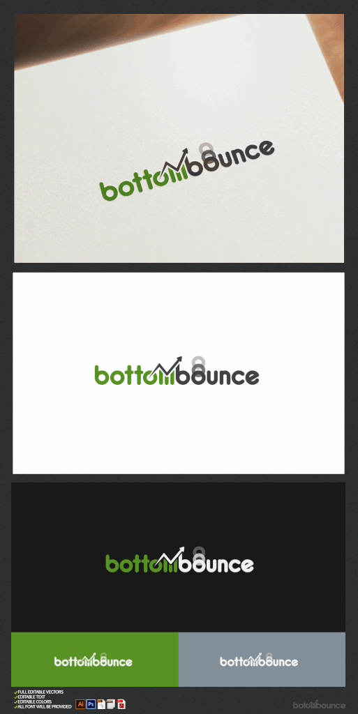
Name: bottombounce
Award: $50 via Paypal
File Type: Vector
Colors: greenish. Should also look good in mono black/ white
Contest runs for 1 week ending 7/15/2017 @ 12 midnight EST
About
bottombounce is a financial trading blog covering stocks that have experienced a sharp price decline and evoked certain technical chart indicators to signal a price recovery. This idea of a "price bounce" should be visually evident in the logo.
I can think of two different ways to achieve this objective that may be combined.
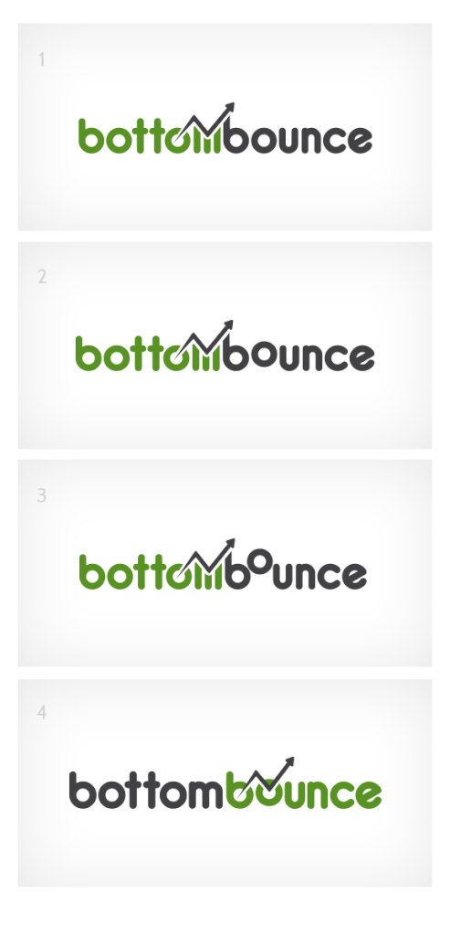
1) by a stylized price chart (simple line going down, then bouncing with arrow pointing up)
2) part of the name could be pushed lower (like a subscript)
The font should be bold and rounded.
I have attached some logo ideas below.
Thank You for consideration.

Name: bottombounce
Award: $50 via Paypal
File Type: Vector
Colors: greenish. Should also look good in mono black/ white
Contest runs for 1 week ending 7/15/2017 @ 12 midnight EST
About
bottombounce is a financial trading blog covering stocks that have experienced a sharp price decline and evoked certain technical chart indicators to signal a price recovery. This idea of a "price bounce" should be visually evident in the logo.
I can think of two different ways to achieve this objective that may be combined.
1) by a stylized price chart (simple line going down, then bouncing with arrow pointing up)
2) part of the name could be pushed lower (like a subscript)
The font should be bold and rounded.
I have attached some logo ideas below.
Thank You for consideration.
Last edited: