Dynadot

REQ-LOGO Logo Design Contest For Cat

Spaceship Spaceship
Watch
Status
Not open for further replies.

joshny

Established Member
Impact
78
It is basically a mascot for a project called Bubbly C A T which is a women clothing and accessories line.
Hence the client is trying to look for a logo which brings in the elegance and sexiness that a woman wants in herself.
it's something which needs cooler and smoother brush-strokes.
Basically , it should be attractive to women and catch their eyes.
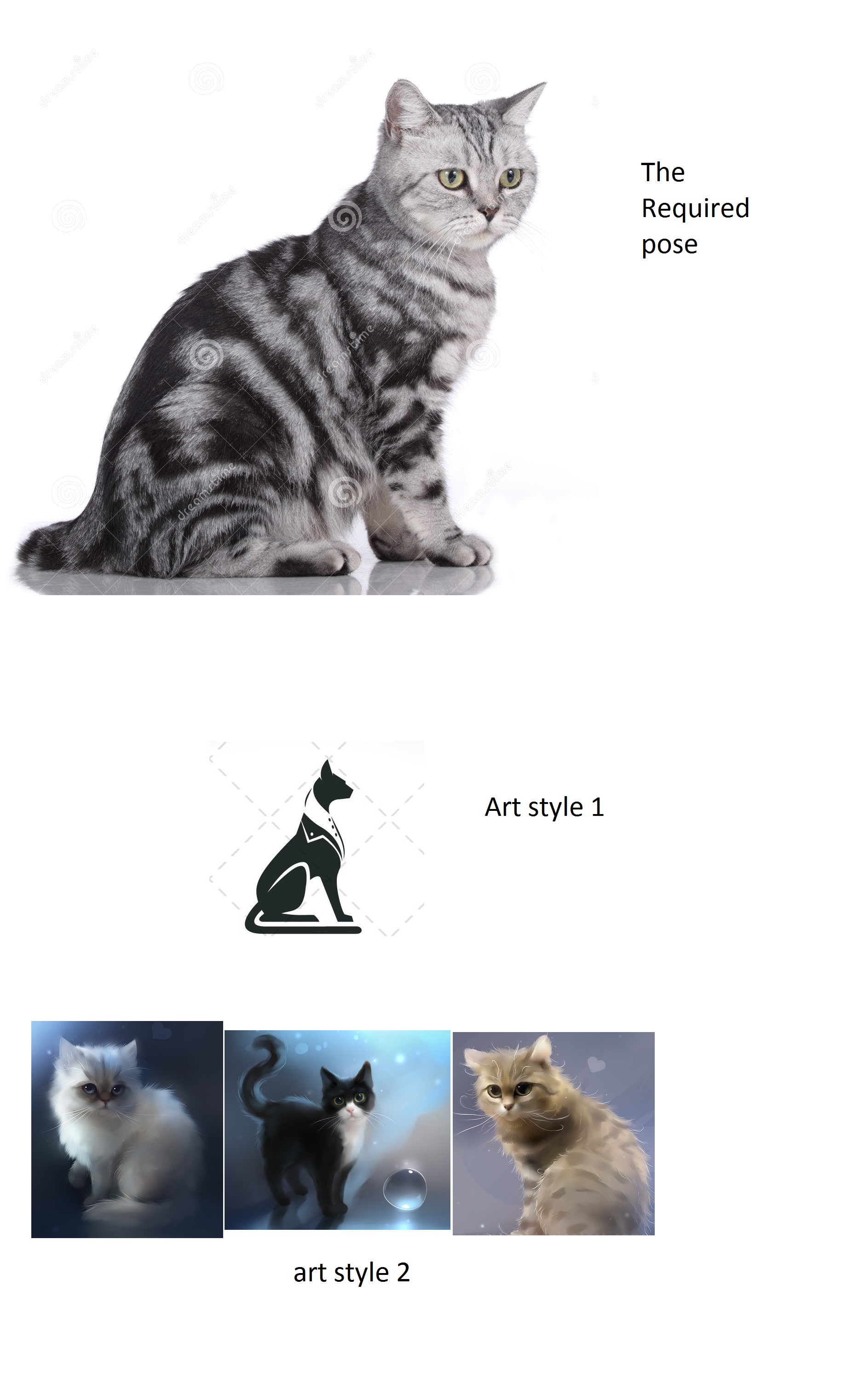
The logo needs to have a cat sitting in the pose which is given below
(whether you make it wear a scarf or anything else is upto you)
Currently the client has chosen two art styles which should be used as inspiration
Art style 1 is the vector type logo which is a cat in a suit, something on this line but for women
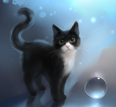
Art style 2 is an illustration type logo which if done should be in the same art style/detailing/brush strokes as the given image

In terms of the contest, preference would be given to illustration type
11.jpg

Please note that if you stick to the illustration type, the coloring scheme should be the same as this cat :
Untitled.png

end time and date 12th september midnight IST;
prize 75$;
 

Attachments

  • cat333.jpg
    cat333.jpg
    75.3 KB · Views: 22
Last edited:
1
•••
The views expressed on this page by users and staff are their own, not those of NamePros.
This is what I imagined for the brand. It's not exactly what your client asked for, but I decided to test my luck by giving it my own twist.

100% original graphics. Higher resolution when you click the image. Feedback appreciated. Thank you

BubbleCat_Kitty_V18.jpg
 
Last edited:
3
•••
This is what I imagined for the brand. It's not exactly what your client asked for, but I decided to test my luck by giving it my own twist.

100% original graphics. Higher resolution when you click the image. Feedback appreciated. Thank you

Show attachment 15804
i'll get back to you with the client's feedback asap, the concept is nice but the design might be a little too simplistic i guess,, like the bowtie though
 
0
•••
You can send your client this instead if you think a slightly more "bubbly" presentation is better :-D

BubbleCat_Kitty_V18.jpg
 
0
•••
Different arrangement. Awaiting feedback. Thanks

BubbleCat_Kitty_V18c.jpg
 
0
•••
The concept was something they appreciated however the design is something they are not too fond of. It looks a little too childish to them and they want something which is a little more formal and which is more on the lines of the original requirements
 
1
•••
0
•••
No Good , I'm sorry this concept was rejected completely.
You should try something on these lines I guess
2.jpg
 
0
•••
I created this by first tracing the first cat example and then stylizing it in a way that's similar to your last example (the black and white cat). So it's a kind of a mixture of the two.

Let me know if your client would like to see this in other colors or without the frame around the kitty. I can also add cloths or a bow to the cat if requested. Higher resolution on click. Thanks!

BubbleCat_Kitty_V26b.jpg
 
Last edited:
0
•••
Here is slightly different version where I added another leg in the front. It's not exactly the same pose as your example, but I think it looks good. I tried several times to put the second leg behind the leg in the same way as the pose, but it didn't look right,

I also added a pendant, to give the cat a more domesticated / classy / stylish / slightly sassy look.

Higher resolution on click. Thanks

BubbleCat_Kitty_V29c.jpg
 
1
•••
1
•••
Here is slightly different version where I added another leg in the front. It's not exactly the same pose as your example, but I think it looks good. I tried several times to put the second leg behind the leg in the same way as the pose, but it didn't look right,

I also added a pendant, to give the cat a more domesticated / classy / stylish / slightly sassy look.

Higher resolution on click. Thanks

Show attachment 15889
While this adheres to the original theme, the client actually preferred your first design over the second as it gave a more feminine look, whereas the latter was dull for a women's clothing line.
 
1
•••
0
•••
While this adheres to the original theme, the client actually preferred your first design over the second as it gave a more feminine look, whereas the latter was dull for a women's clothing line.

I agree. A simple, natural looking cat doesn't look male or female. So In this version. I made the cat more slender with feminine curves and more attractive eyes. I also gave it a bow to insure that it is a female cat. It's an attractive LADY cat now...prim and proper.

BubbleCat_Kitty_V33b.jpg
 
1
•••
I also added a fourth leg...
 
0
•••
This is just one of the millions of ways to use my last logo submission. I think it's has a healthy amount of flexibility of usage and a lot of potential.

BubbleCat_Kitty_V35b.jpg
 
Last edited:
1
•••
3
•••
Try changing the face line to make it into something of a smile or "U" shape . The name is bubbly , so the cat need to be sort of happy-ish, the design is good but the looks of it portray arrogance or ego
 
0
•••
0
•••
Your first design still beats them all

I liked the first one too. But my second last submission seemed like what you were looking for.

1) It's feminine

2) It's standing in a similar position that you asked for.

3) It's a take on the style you asked for.

4) It's not kiddish or childish looking as requested.

I feel like I checked off everything so if you could give me some constructive feedback on what I'm missing, I would appreciate it. I think a little more direction would help everyone :)
 
0
•••
I liked the first one too. But my second last submission seemed like what you were looking for.

1) It's feminine

2) It's standing in a similar position that you asked for.

3) It's a take on the style you asked for.

4) It's not kiddish or childish looking as requested.

I feel like I checked off everything so if you could give me some constructive feedback on what I'm missing, I think that I can nail the design. I just need a little more direction.
I thought of it to be the same, what the client did not like in the second last submission is the face & eyes of the cat, that is something which does not portray the "bubbly" or "cute"ness that he wanted, which is why he is still looking at your first design as the best amongst them
 
0
•••
Really? Oh IC. When you told me the first one looked too childish, I went for a more "formal" appearance as you mentioned they wanted. But it sounds like your client may actually want something that's very cute and "bubbly" but somehow NOT kidd-ish. Is it possible to have your client clarify what he means, because I may not be the only one confused. I hope I'm not being difficult. But it would also stink for the client to have to select a design that's not a good representation of what he wanted, so more direction is a good thing.
 
0
•••
A cuter, more bubbly take. This cat has had more cosmetic surgery than Michael Jackson :-D

BubbleCat_Kitty_V38.jpg
 
Last edited:
2
•••
A different font and a close up of her face.

BubbleCat_Kitty_V38b.jpg
 
1
•••
Thank you for the feedback. I tried to make the cat look happy :D Didn't quite understand the U-shaped face thing.
bubbly8.png
bubbly-cat-presentation-1.jpg
bubbly-cat-presentation-2.jpg
 
4
•••
Status
Not open for further replies.
  • The sidebar remains visible by scrolling at a speed relative to the page’s height.
Back