Dynadot

[REQ-LOGO] - Logo needed for online Q&A community ($50)

Spaceship Spaceship
Watch
Status
Not open for further replies.
*IMPORTANT note for entrants -- please do NOT write the name of my site in this thread; I'm trying to keep this thread from being crawled/indexed by search engines.*

Type of Contest: Logo design
Prize: $50
Contest End Date & Time: Tuesday June 14th, 11:59pm EST

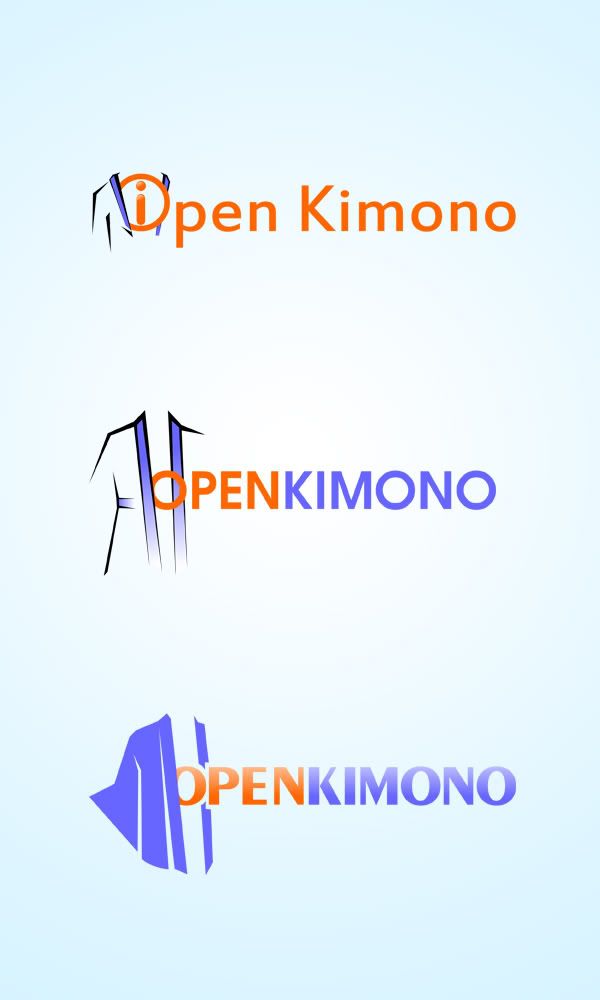
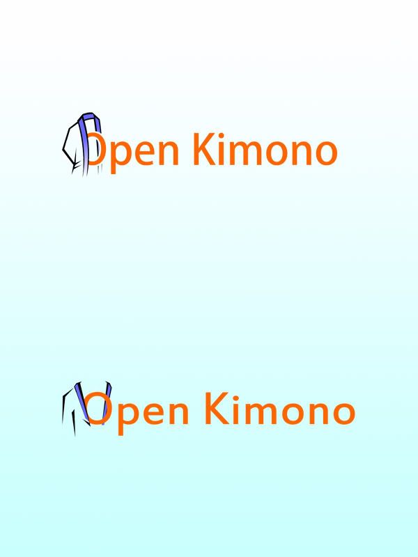
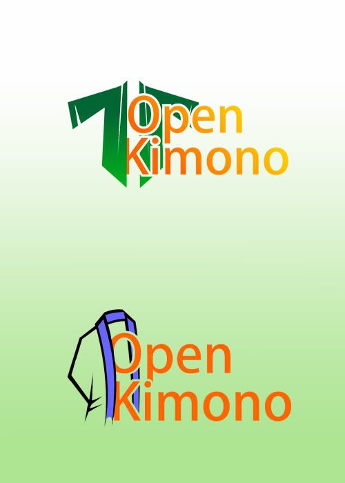
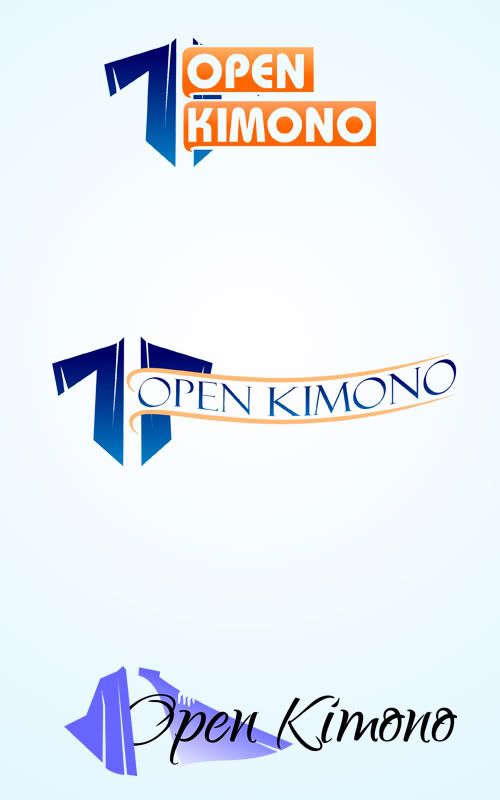
The name of our site is:
oktext.jpg


It's an English expression that means to share information freely, or to "lift the veil" and reveal what's behind the curtain. Here's a full definition. (A 'kimono', for those who don't know, is a japanese garment.)

Size Requirements: I don't want to give an exact size/shape since I don't want to constrain your creativity; but this will be the main logo for our website and will appear in the traditional upper-left location so it should probably be rectangular. Use 500x200 as a guideline, but reasonable deviations from that are fine.

Color Requirements: We've been using BLUE as the color scheme to this point, but you don't have to.

Additional information:

You have a lot of leeway regarding creativity. Just some ideas, in no particular order:
- I gave the meaning of the expression above, so you can try and incorporate the essence of openness / transparency
- You can incorporate a picture of a kimono, but you certainly don't have to (Here's a basic clip-art image, or you can find/create your own)
- Or your entry might just be a stylized version of our site name.

It's completely up to you -- I've been impressed with the talent/creativity in this forum in the past.

I will provide fast and frequent feedback to any and all entries!
 
Last edited:
0
•••
The views expressed on this page by users and staff are their own, not those of NamePros.
Here's 3 concept ideas to get things started
Numbered for easy reference


Feedback Appreciated​
 
0
•••
Here's 3 more concept ideas
Numbered for easy reference


Feedback appreciated​
 
0
•••
Thanks for your entries, Scorpion. Some thoughts:

The designs you submitted that tried to incorporate images (1, 2, 4) didn't really do it for me. I'm not sure whether it was because I couldn't really tell that the image was of a kimono, or something else, but I just wasn't crazy about them.

The speech-bubbles in #'s 3 and 6 were a little better...#3 probably my favorite of the bunch, but I wasn't sure whether it was clear that the nested things on the left were speech/thought bubbles.


Hoping to see submissions from other designers too!


Something we're hoping have represented, as I mentioned in the original post is the essence of openness/transparency...which is what the expression's definition is.
 
0
•••
Thanks for the feedback
Revised Concept samples
Numbered for easy reference


Feedback Appreciated​
 
0
•••
Here's 3 more variations
Numbered for easy reference


Feedback appreciated​
 
0
•••
here is my try

logoKemo.jpg

Feedback would be great
 
0
•••
0
•••
Thanks guys, will give feedback in a few hours!
 
0
•••
0
•••
0
•••
Hello,
thanks for inviting me in this contest.
Here are my five suggestions for your Q&A community, I hope you like.
47894092.png
 
0
•••
Thanks for the entries, guys: I will give feedback within the next 5 hours.
(also going to PM mod Scorpion to ask whether I can extend this contest deadline to Tuesday evening, given that there are several entries and I want to allow for appropriate feedback / incorporation)
 
0
•••
(also going to PM mod Scorpion to ask whether I can extend this contest deadline to Tuesday evening, given that there are several entries and I want to allow for appropriate feedback / incorporation)

Yes, you may extend the contest 2 days from the deadline, which would put it at Tue evening. :)

Eric Lyon
NamePros Team
 
0
•••
Hi everyone, thanks for the entries. I'll provide consolidated feedback here, and will be quick to respond to all entries between now and the new contest deadline of 11:59pm Tuesday June 14th.

First, we are looking for a very SIMPLE, WEB-FRIENDLY type of logo -- nothing overly intricate or detailed.

Second, please do not use "speech bubbles"...after seeing what they look like, we're not crazy about them as part of a logo.

Having reviewed all of the submissions, there are two worth noting:

1) nguyen_huy_hai's first design, as seen here (the purple/orange one). It's simple and geometric, yet still resembles a kimono. Very web-friendly, much like the logos of facebook, twitter, etc. We'd like to see if something like this could be adapted to show a kimono that's either open or about to be opened, with a simple/round head sitting on top.

2) dlight's second design, as seen here (the one with the open shirt). We don't want speech bubbles, but we like the idea of it being an open garment.

Both of the two designs mentioned above show some sort of kimono-like image. If we could combine the simplicity of (1) with the open garment concept of (2), that would be ideal.

For further reference, the following pic captures the true essence of what the expression means:
http://www.zbasic.com/pand.jpg. It's definitely too intricate/detailed for a web-friendly logo, but it's a good illustration of the message we're trying to get across (a person revealing something of himself). A simpler, "cuter" version of this (think minimalist, basic geometric shapes) would definitely be a strong contender.

I'll be at my computer for most of the next 3 days and happy to respond to any questions / new submissions quickly!
 
Last edited:
0
•••
Another concept


Feedback appreciated​
 
0
•••
Thankyou for feedbacks, here're my revisions:
openK2.jpg

Thanks!
 
0
•••
Thanks for the submissions.

A quick note to all designers: if you are looking for images to incorporate, I have found that searching for "robe" or "bathrobe" has produced more results than the much less common "kimono"...and they often look very similar.

@scorpionagency: your most recent entries are a little to "suggestive"; we are trying to stay away from images that are too risque.

@nguyen_huy_hai: thanks for these entries. I like the effect of an image of a kimono / robe partially open, with the text peeking out of it. (Although I don't understand what the circle with the letter "i" is in the first of your new designs...)

A few ideas:
- Do you have any other styles of kimonos you can use? We like the 3 most recent images, but still not in love with them.
- Can you perhaps show us a version where the words "open" and "kimono" are on separate lines instead of all on the same line?
 
0
•••
0
•••
openK3.jpg

The "i" I used to describe "information"
Thanks!
 
0
•••
@dlight:

Thanks for the entry; I like it! Not particularly crazy about the colors though; the blue is a little too "neon"...could you show me that design with a couple different color schemes? Also, we prefer a font more like what nguyen had in his 3rd entry HERE.

@nguyen: Thanks for the revisions; perhaps I wasn't clear in my earlier post, though >> I wanted to see what you could do if you put the word "kimono" below the word "open", with both letters "OK" and "K" peeking out of the kimono.
 
0
•••
Thankyou! My revision:
OpenK4.jpg

Thanks!
 
0
•••
Here's another concept


Feedback Appreciated​
 
0
•••
Thanks for the submissions, guys. These are my favorite images of the kimono -- 2 of them are nguyen's, and one is dlight's:

33.jpg


Now the only issue is that I haven't been crazy about any of the text. In other words, I'm still hoping to be shown a way of incorporating the name of our site:
oktext.jpg
into the image. I'd love to give more specific feedback, but it's just one of those things where I don't think I'll know it until I see it...
 
0
•••
0
•••
Status
Not open for further replies.
  • The sidebar remains visible by scrolling at a speed relative to the page’s height.
Back