IT.COM

(REQ) - LOGO Design $50 Prize Payouts Paypal

Spaceship Spaceship
Watch
Status
Not open for further replies.
Type of Contest : LOGO & Header Integrated Design

Prize : $40.00 First Prize / $10 Runner-up(s)

Contest End Date & Time : June 23 2010, 10pm PST

Size Requirements : Vector - Scaleable

Color Requirements : Eye Friendly Colors

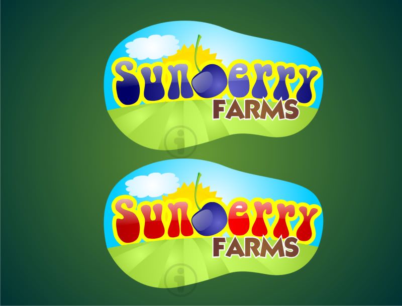
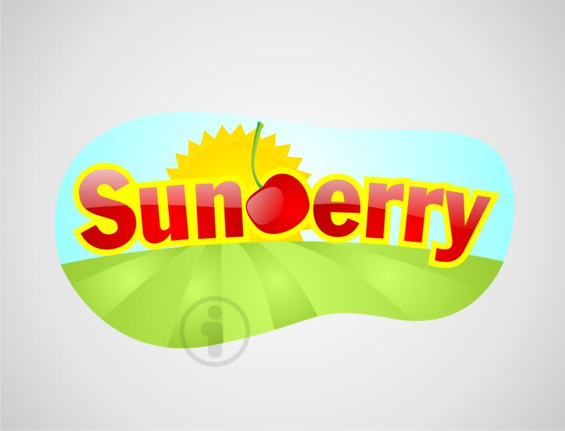
General Requirements : This is a logo design for a packaging label for "SUNBERRY FARMS" a Blueberry Farm, the SUNBERRY can be more prominent than the Farms text in terms of size. I would like to incorporate a blueberry, or blueberries in the deisgn somewhere in terms of graphic, as well as sun rays, or a sun, hence the Sun Berry. Looking for a clean cut contemporary design, that will stand out creatively, would be interesting to see a blueberry make the B in SUN"B"erry graphically.


It is a contest for a logo/header combination, basically they go hand in hand, the logo and header should integrate the same sort of graphics, and concepts.

I will be providing feedback, and if I feel the contest is very close I will provide runner up payouts just to compensate for time spent. Paypal will be used for payouts.


Additional Information :Once logo is designed I will need some text added to the label such as Product Of,and Fresh Blueberries,and SunberryFarms.com, but focus on design, and a few lines of text can be added later after winner is picked. If you have any questions please ask
 
Last edited:
0
•••
The views expressed on this page by users and staff are their own, not those of NamePros.
Will give this a try as soon as possible.
 
0
•••
Thanks Ancitis, If you have any questions, please feel free to ask, looking forward to what sort of creative designs all you expert designers can come up with.
 
0
•••
sunbbery.jpg
 
0
•••
0
•••
Gunveer, I quite don't know what to say about your design, you will have to come up with something a little more creative to win this.

Dlight, it just doesn't stand out, need something more bright, I have attached samples to help everyone...

I want the example in the middle, with a blueberry, and integrated with the blue ribbon label, if possible, different variations will help, so take screenshots along the way before you add more to the logo...
 

Attachments

  • 2.jpg
    2.jpg
    32.1 KB · Views: 92
0
•••
0
•••
I know my design is horrible......Anyway thanx.....I ll try again.Thank once again
 
0
•••
So here is my try based on your last comments.
2nbascn.jpg

Thanks.
Ancitis
 
0
•••
here's my entry...still thinking about where to incorporate the blue ribbon. If feasible you may want to incorporate that in the packaging?...thx

waiting for confirmation...thx bob m
 
Last edited:
0
•••
0
•••
0
•••
Bob_M, I'm not sure who are you aiming that at, but I'm aware of that. Thanks. :)
 
0
•••
Here's another version.
2lcr61w.jpg

Thanks.
Ancitis
 
0
•••
here's my entry...still thinking about where to incorporate the blue ribbon. If feasible you may want to incorporate that in the packaging?...thx

waiting for confirmation...thx bob m

Hi,

I don't see anything, just waiting on feedback from client, don't worry about blue ribbon if you cannot incorporate it in.

---------- Post added at 09:18 AM ---------- Previous post was at 09:17 AM ----------

Here's another version.
2lcr61w.jpg

Thanks.
Ancitis

Ancitis, very creative, can you make the stem a little thicker on the blueberry, to make the B pop out a little more?
 
0
•••
Thanks for the feedback.
Here it is with the "B" more thicker.
14vjozq.jpg

Thanks.
Ancitis
 
0
•••
Yes guys, please try to be as original as possible with your designs, I dont want any concepts copyrighted by other companies being used here.
 
0
•••
Here's my try...
sunberry.jpg


Feedback appreciated.
 
0
•••

I like where you are going with this, with the text can you round it out a bit more, and try a blueish purple, or a greenish sort of color, and make the cherry into a blueberry.

---------- Post added at 11:52 AM ---------- Previous post was at 11:51 AM ----------

Thanks for the feedback.
Here it is with the "B" more thicker.
14vjozq.jpg

Thanks.
Ancitis

Very Attractive Design, The B is very hard to read, anyway we can make it stand out a bit more?

---------- Post added at 11:53 AM ---------- Previous post was at 11:52 AM ----------


Like the concept can you make the sunrays yellow, and the Blueberry "B" a bit smaller, and more blended into the text, and the font color a bluish purple, or greenish color.

---------- Post added at 11:54 AM ---------- Previous post was at 11:53 AM ----------

Here's my try...
sunberry.jpg


Feedback appreciated.

Glaxxon, anyway you can make the berry, into more of a true blueberry, instead of a cherry,and maybe a bit of a background to the graphic.
 
0
•••
0
•••
Hi,
Thanks for the feedback again.
Here are a couple more versions then.
14ilzi8.jpg

Thanks.
Ancitis
 
0
•••
still over 24 hours to go
 
0
•••
0
•••
Hi,
Thanks for the feedback again.
Here are a couple more versions then.
14ilzi8.jpg

Thanks.
Ancitis

Ancitis, anyway to make the "B" in the text thicker like the rest of the font, or will it throw the graphic of the blueberry stem off, maybe try to get close so the "B" is more obvious..................
 
0
•••
Another version then, with the B more thicker and obvious.

2e2nqq8.jpg
 
0
•••
Status
Not open for further replies.
  • The sidebar remains visible by scrolling at a speed relative to the page’s height.
Back