IT.COM

$40 logo contest

Spaceship Spaceship
Watch
Status
Not open for further replies.
Contest Closed

Coolwanz the winner!
 
Last edited:
0
•••
The views expressed on this page by users and staff are their own, not those of NamePros.
Krossat

Hi Krossat, Firstly thanks for taking the time and effort put into your designs. Ilike the direction your pointing in, but feel the design lacks a little of the modern/sleek feel we are looking for. If you could keep the badge but change maybe colors and add some depth to the image. But again i do like the direction of the design! Look forward to seeing what you can come up with.
 
0
•••
Here is the second concept!


2.jpg

3.jpg

Edit :

3-1.jpg

would appreciate a feedback!
coming up with one more concept. :)

Thanks,
Krossat
 
Last edited:
0
•••
Krossat

Really like the idea, nice! Look forward to your other concept!

Thanks again!
 
0
•••
Thanks for reply

Here is the third concept!


5-1.jpg

5-2.jpg


5-3.jpg

and the last concept :)

6-1.jpg


6-2.jpg


would appreciate a feedback!
Will convert some to web 2.0 theme also later on. let me know in case of any changes.

Thanks,
Krossat
 
Last edited:
1
•••
Krossat

I really like all the concepts, you have certainly raised the bar in this contest. Will get some feedback from my client once I get a few more entries in.

Thanks again for the great work and effort!!!
 
0
•••
thanks for the feedback revisions will be made soon
 
1
•••
~removed.
 
Last edited:
1
•••
ekenney

Please read size requirements in original post. Thanks for your effort!

ric_bia

Another great entry by ric-bia. Thanks for taking the time to enter. I like what you have done. Please try another concept before I take the designs to my client to see what they think.
 
0
•••
Logo Proposition for HOPE FOR YOUTH MINISTRIES
....................................................................
youthimg.png
 
Last edited:
0
•••
coolwanz

Hi Coolwanz, delighted you have entered the contest. I like the design although I'm not convinced about the three flying objects in the logo. Maybe you could work on them a bit and see what you can come up with. My client does not want any symbols even supposed angels etc Maybe if they were more child/youth-like images.
 
0
•••
Hi scopeweb,

thank you for the feedback. .-)

Actually, those 3 images are representation of youth and the hands are raised to convey hope and spirituality.

I retweaked the images so they appear more youthful/person like below. Let me know if this finally works. .-)

youthimg2.png


coolwanz
 
Last edited:
0
•••
coolwanz

Yes! Very nice... Could you throw in another completely different concept?

Any more entries as I would like to take the designs to my client in about 24 hrs to get his thoughts on the designs and any modifications before we choose the winner?
 
0
•••
HopeForYouth.jpg


Quick attempt, simple approach. I might be able to put something else together before your deadline.

Best of luck!
 
Last edited:
1
•••
gartrout said:
HopeForYouthMinistries.jpg


Quick attempt, simple approach. I might be able to put something else together before your deadline.

Best of luck!

link seems to be dead???
 
0
•••
scopeweb said:
link seems to be dead???
Sorry, I switched it over to a better source.
 
0
•••
Thanks scopeweb. I will try to another design concept and will post later. .-)
 
1
•••
gartrout

Thanks for your effort but your design is not really what we are looking for.
 
0
•••
Hey,

Here is a concept, not 100% done, but just to get an idea of direction. Let me know.

hopeforyouth.jpg
 
1
•••
Sammyloski

Thanks for the effort, but just looks like other concepts that have already been submitted! Why not try something different!

Thanks
--------------------------------------------------------------------------

Designs are now in the hands of the client.

Awaiting results! Thanks for all the entries.
 
Last edited:
0
•••
Okay here is the feedback from client: There are two designs they like:

Firstly coolwanz and post 36 But they ask can you round of the arms as they look at bit like horns. If you could make them look a bit more like arms. Thanks!

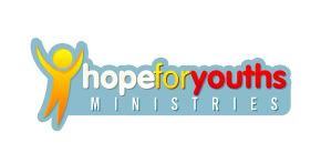
Secondly Krossat middle logo in post 27. Again they ask can you make the outstreched arms in the logo take palce of the Y in the text! Thanks


Everyone else thank you for your entries. Some great ideas and as always I appreciate the effort and time put into the logo's and I look forward to seeing more of your entries in new design contests coming soon!
 
0
•••
Thanks scopeweb. I will do the revision, and will post the updated version today.
 
0
•••
Will do too :)
Thanks!
Kross

Edit :

As per you'r feedback here are some changes in my enty

f-1.jpg
[/CENTER]

f-2.jpg
[/CENTER]

f-3.jpg
[/CENTER]

f-4.jpg
[/CENTER]

If there is any more modification or changes, please let me know

Thanks again
 
Last edited:
0
•••
Updated Logo as requested
................................................
youthimg3.png
 
0
•••
Sorry for the short delay folks but my clients have chosen the winner!

coolwanz

Please send paypal details and file!

Thanks again for a great logo as usual!!

Again a special word of thanks to all who have entered!
 
Last edited:
0
•••
Thanks scopeweb for selecting my design. .-)
Files sent. PP received.

Everyone did very well. kudos to all.
 
0
•••
Status
Not open for further replies.
  • The sidebar remains visible by scrolling at a speed relative to the page’s height.
Back