Dynadot

[REQ - LOGO] Total Electronic Cigarettes

NameSilo
Watch
Status
Not open for further replies.
Type of Contest: Logo
Prize: $40.00 via PayPal (or equivalent NP$) to winner of contest
Contest End Date & Time: Winner will be chosen on March 21st (1 week)
Size Requirements: 350x80 but flexible
Color Requirements: We are open to any color schemes

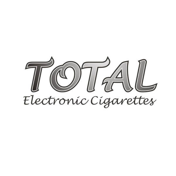
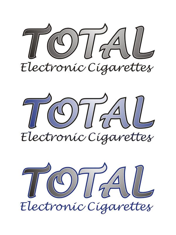
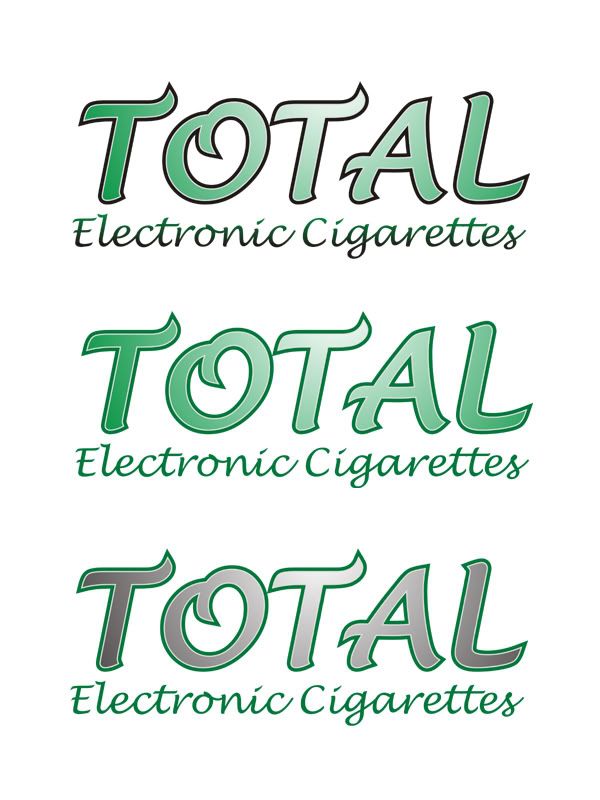
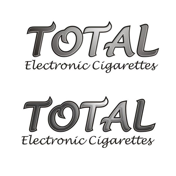
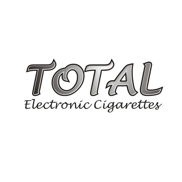
Additional Information: An idea of the style we are looking for is below. Since most of the customers are older, the logo needs to be classy and not cartoonish. We want something with a flat looking outline and the letters looking raised, like a totally different layer on top. We would also like the letters to have some kind of gradient or shiny lighting effect. Any colors that look good. The font is Lucida Handwriting, please use that or something with a similar look.

totallogonopadding.png


**THIS LOGO WILL BE USED FOR RETAIL PRODUCT PACKAGING – IT MUST BE CLEAN & PROFESSIONAL**

Feel free to be creative; design restrictions aren't that limited. Zero (from TOTAL) and I will be providing feedback after each entry. I may end the contest early if someone comes up with what we feel is the perfect look.

Good Luck Everyone! :)

Thanks,
OH
 
0
•••
The views expressed on this page by users and staff are their own, not those of NamePros.
0
•••
0
•••
here my first try :

xo1gdw.png
Looks good. I like the red better than the yellow. The gradient is also pretty sleek on the red one.

Try with more of a contrast between the font color and the outer stroke (like the original example but with your own style). Also, can you make the inner lettering look a bit more raised above the outline?

Thanks,
OH

---------- Post added at 01:40 PM ---------- Previous post was at 01:38 PM ----------

Very professional looking! Can you raise the inner text a bit and try with more of a contrast? See my response to dlight for a more detailed explanation of what we need.

Thanks,
OH

---------- Post added at 01:41 PM ---------- Previous post was at 01:40 PM ----------

Also, for everyone:

More color combinations would be great. Zero just mentioned that she'd like to see it with some blue in there.

Thanks.
 
0
•••
Oh yes, another thing...

Nobody should feel the need to keep the same exact font. I fear that would limit creativity. We happen to like the look of the font in the OP, but feel free to mess around with others if you want.
 
0
•••
0
•••
here another try, feedback will be great

2cnjwud.png
 
0
•••
totalec2.jpg

Thankyou!

I'd like to see a variation of this in green. Not a fan of the last one, the colors kinda clash. The middle color I like. I also like the larger white border you had on the original one.

---------- Post added at 04:49 AM ---------- Previous post was at 04:45 AM ----------

here another try, feedback will be great

2cnjwud.png

I like the whole color/gradient/stroke color on the first one, just not a fan of that particular font. I'd definitely like to see that one in the original lucida handwriting.

The second one is a little too mono-color. Definitely need something with a little more contrast.


We just learned that we can not use red for the logo.

Thanks for the submissions, so far I'm happy with what we're getting.
 
0
•••
^^^

Guys, -zero- is from TOTAL and will be responding to entries from time to time. I know I mentioned this earlier, but just wanted to make it clear.

Thanks,
OH
 
0
•••
totalec3.jpg

Thankyou for so fast feedbacks!
 
0
•••

I think that the green just isn't working for the look we want. Your first entry (the silver/white/black one) is better than your later entries. Can you try it with more of a raised text and experiment with different shades (shinyness) of silver gradient?

Thankyou for so fast feedbacks!
No problem.

Thanks,
OH
 
0
•••
Removed
 
Last edited:
0
•••
My first entry after "raised" text by photoshop (not the vectors files, but I can give you any size of logo as your request)
totalec4.jpg

Thanks!
 
0
•••
My first entry after "raised" text by photoshop (not the vectors files, but I can give you any size of logo as your request)
totalec4.jpg

Thanks!

Much better. The top one is cleaner looking than the bottom.

Can you try combining that new one with the thicker white outline from your first entry here:
Thanks,
OH

---------- Post added at 09:06 PM ---------- Previous post was at 09:03 PM ----------

Hi CH

This is my first entry. I have used two separate fonts for the tagline for you to choose from. Feedback will be appreciated. Regards

totalp.jpg
I like the silver gradient look. It has potential.

As far as the outer stroke, try some different color combinations. They aren't too happy with aqua blue.

The font on the top is good except that it looks like it says "COTAL". You can use the same font with a different T, or just mess around with other similar fonts. Also try some bold on TOTAL text.

Thanks,
OH
 
0
•••
0
•••
This is the best one you have done so far. Good stuff!

We're not confident enough in your design to end the contest early, so others can still submit entries. In the meantime, you are free to try some other concepts if you want.

Thanks.
 
0
•••
My first entry:

6enp0w.png


Hope you like it!
 
0
•••
My first entry:

6enp0w.png


Hope you like it!
This is pretty nice as is. The only problem is the packaging can't be committed to a blue background and I'm not sure if it will look good with other ones.

Can you try it on white and maybe 1 or 2 other colors of your choice?

Thanks,
OH
 
0
•••
Thank you for the positive feedback, here's one with a white background, can provide more variants upon your review.

Variant A:
2irsoxj.png


Variant B
2iqlfty.png
 
0
•••
0
•••
0
•••
Hi Guys,

Thanks for the submissions.

Zero will be available after 10am our time (8 hours from now) to confer about the new designs. She or I won't be able to post feedback until much later today. Thanks for your patience.

Everyone else: Keep 'em coming!
 
0
•••
0
•••
Thank you for the positive feedback, here's one with a white background, can provide more variants upon your review.

Variant A:
2irsoxj.png


Variant B
2iqlfty.png

Like OH said, this looks sharp on the blue back ground, but we can't be committed to that. Against the white it doesn't look as good, but I think with a black or other dark outline it could look good. Give that a shot. I like the font, but I think I like the bolded look for the logo best, so give that a try too please.

---------- Post added at 05:00 PM ---------- Previous post was at 04:53 PM ----------

Here another try

25sl6bq.png

I really like the blue one, this is tied as my favourite so far with nguyen's last entry. Don't have any suggestions on how I would make it better unless you want to play around with some variations based on different colors or whatever. But it's definitely great as is.

We can't use anything that has red as a prominent color.

---------- Post added at 05:05 PM ---------- Previous post was at 05:00 PM ----------


Variant C:
2v19lhh.png


Variant D:
2e1hy8j.png

I have the same remarks for both of these entries. Like both fonts, but I think we're looking for a bolded look. And they all look too plain to me. We really want something that looks sharp with some nice color combinations.
 
0
•••
Removed

Thanks
 
Last edited:
0
•••
Status
Not open for further replies.
  • The sidebar remains visible by scrolling at a speed relative to the page’s height.
Back