IT.COM

[REQ-LOGO] Festz! Logo for $40

Spaceship Spaceship
Watch
Status
Not open for further replies.
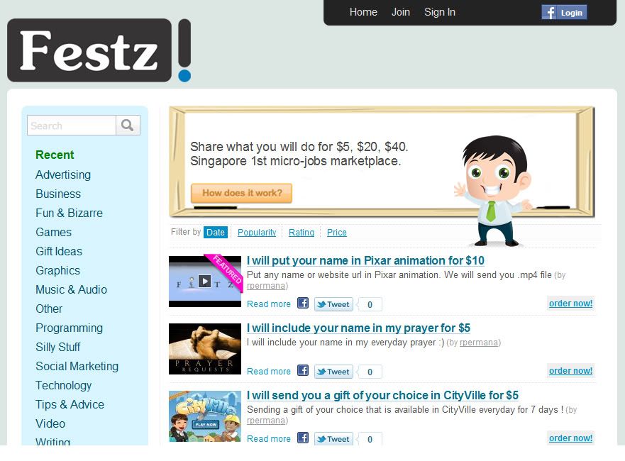
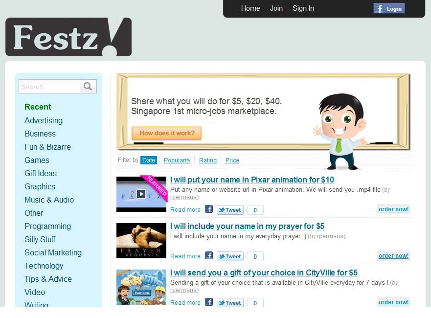
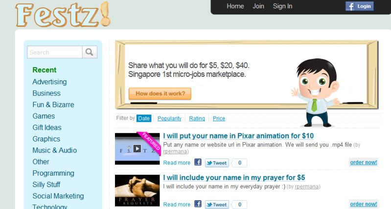
Type of Contest : LOGO Design for Festz!
Prize : $40.00
Contest End Date & Time : 9.00PM (GMT+8) : 28 March 2010
Color Requirements :
1. View the site here at http://www.festz.com.
2. Colour of logo must match with the background.
3. Horizontal position.
4. Simple & clean. Not so crowded.
Like : Twitter.com , uphype.com

NB: Word should be Festz! (with a ! at the end of word)
 
Last edited:
1
•••
The views expressed on this page by users and staff are their own, not those of NamePros.
festz2.gif
 
Last edited:
0
•••
Fiverr like logo.. :)
Looking for more concept..
 
0
•••
Removed
 
Last edited:
0
•••
Soheil, what is that icon? Is that some sort of tree ?
 
0
•••
0
•••
@Soheil : so the 3 curly lines are hair then ?

@steveteva : Love the font & the placing of the logo. However, you can remove the TM sign and put a "!" sign at the back like "Festz!".
 
0
•••
@steveteva : Love the font & the placing of the logo. However, you can remove the TM sign and put a "!" sign at the back like "Festz!".

festz3.gif
 
0
•••
@steveteva, maybe you can redesign the ! mark and put different colour?
 
0
•••
0
•••
hello Soheil, thx for your input.
font doesn't suit the site, need something fresh. Icon is a bit misleading.
 
0
•••
attachment.php
 

Attachments

  • festz.jpg
    festz.jpg
    13.6 KB · Views: 110
Last edited:
0
•••
My entries here:
#1
Festz1.jpg

#2
Festz2.jpg

Thanks!
 
0
•••
0
•••
festz3-4.png


festz1.png


festz1-2.png


festz2.png


festz3.png


Some tries.
Feedback appriciated.

thanks
 
0
•••
0
•••
@steveteva: Thanks... looks better now.
@Abdel : need a better concept
@Zynge.net: like first and second concept, quite creative on the placement. but try different colour on the second logo.
@Gooddesigner: I prefer to focus more on the wording design. Icon may not be necessary.
@nguyen_huy_hai: second concept is preferred, but it does not blend well with the whole site.

Thanks everyone !!
 
0
•••
Removed
 
Last edited:
0
•••
0
•••
Thanks for the feedback.
As instructed I went with other colors on the second concept:

festz4.png


festz4-2.png


festz4-3.png


festz4-4.png


Also tried with one more idea:

festz5.png


festz5-2.png


If you like the idea, of the splash shape behind the "!" I can try with other colors aswell and with maybe more clean splash shape. I could also put a very wide white splash shape behind a whole text...

I have one more idea, will post soon.
 
0
•••
0
•••
@Zynge : splash concept just doesn't work. Black will suit best.

So far I like steveteva logo. I might do early closing on this contest, most likely tomorrow.
 
0
•••
festz_newconcept.png


festz_newconcept1.png


what about this?
 
Last edited:
0
•••
Thanks for all your submission,

Contest will end 1 day earlier means in 10 hrs time.
 
0
•••
@steveteva, maybe you can redesign the ! mark and put different colour?

Tried this with green lemon color like Festz sounds a bit like zest :) and the boy on your page have a green tie too

festz4.gif
 
Last edited:
0
•••
Status
Not open for further replies.
  • The sidebar remains visible by scrolling at a speed relative to the page’s height.
Back